In January I did a morning warm up sketch of a girl being bullied and knocked down at school. It soon turned into a series of sketch and then a complete narrative.
Here’s the series in it’s completion:
In January I did a morning warm up sketch of a girl being bullied and knocked down at school. It soon turned into a series of sketch and then a complete narrative.
Here’s the series in it’s completion:
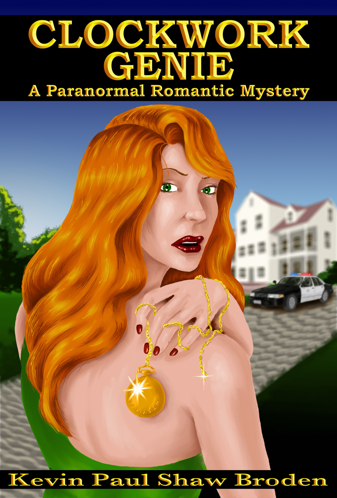
I have done some reworking on the novel, and on the cover as well.
I digitally painted it in Painter and Photoshop.
Additionally I tweeked the subtitle: A Paranormal Romance Mystery
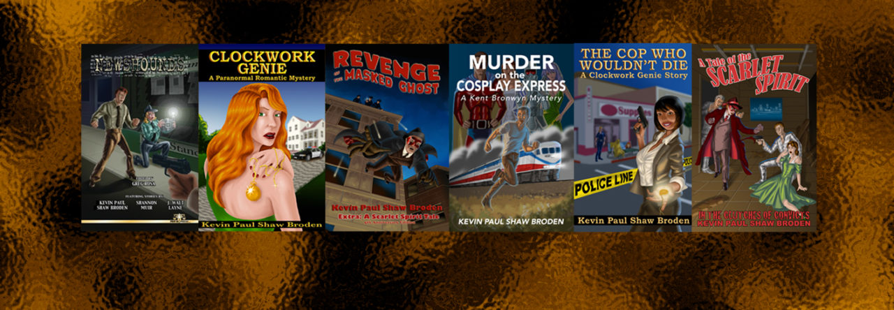
You can buy a copy of the novel at any ebook distributor.
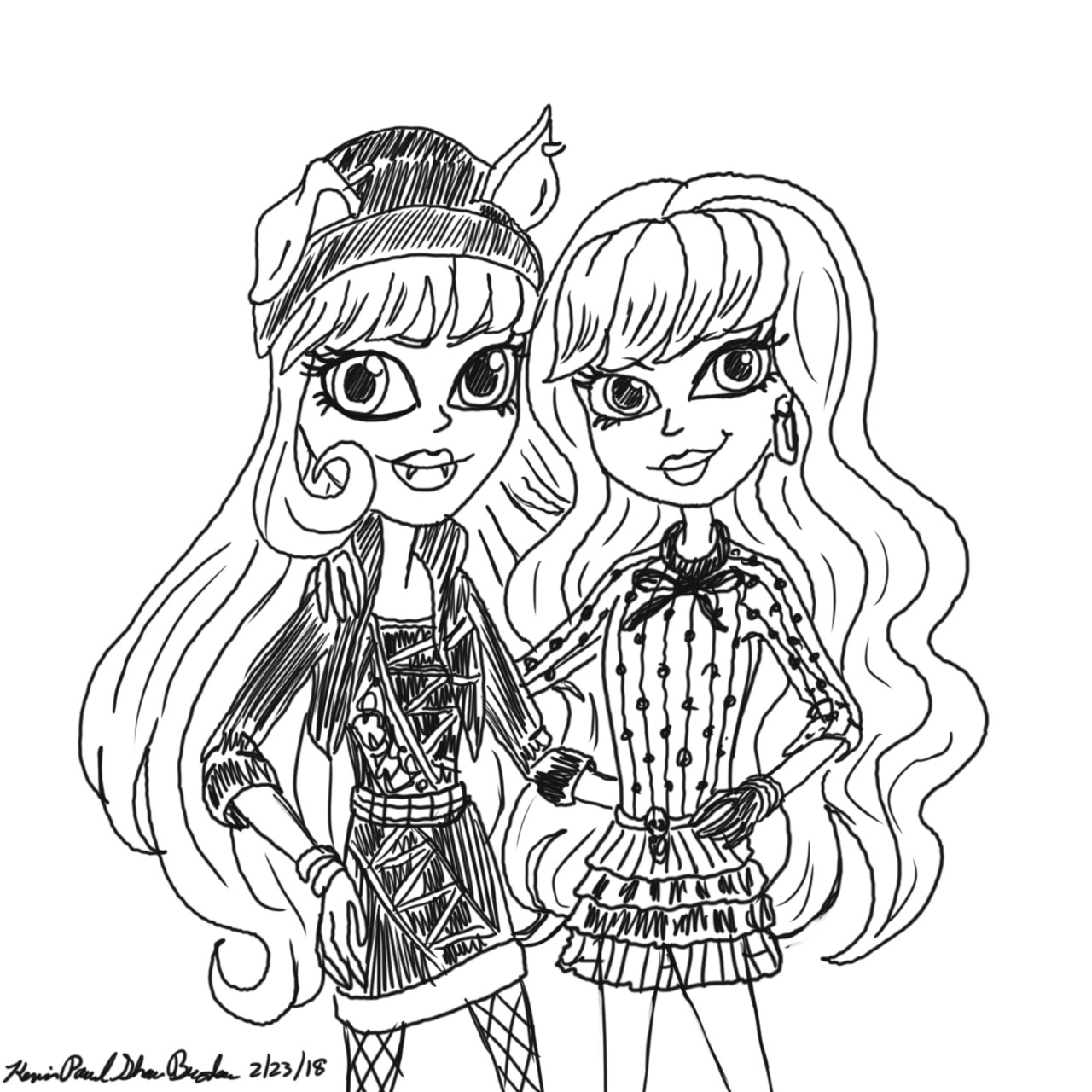
Here is my today’s sketch. Of Howleen Wolf and Twyla from MONSTER HIGH: THIRTEEN WISHES.
I’ve been watching all the different EVER AFTER HIGH and MONSTER HIGH movies, and I like each of them for different reasons.
MONSTER HIGH THIRTEEN WISHES is to me perhaps one of the best of them.
It does what all these movies are required to do, first off introducing the latest version of the dolls, as well as the new ones for that season, put our characters into an adventure, and stress the theme of “All are welcome at Monster High, Freaky Flaws and All.”
In my opinion Thirteen Wishes goes a few steps further than most of the others do. Because it delves far more into the characters than the other movies do.
The basic theme here is about feeling alone and ignored, and what you do to have friends, be popular, and be accepted. Which is shown through Howleen Wolf and how she is tempted by the genie magic. While her friend Twyla doesn’t mind living in the shadows.
Even the new character of Gigi is shown hurting because she’s lonely, which results in the creation of the threat endangering everyone. That of Wisp.
It is further shown in Cleo when everyone forgets who she is, but even though she tries to pull herself back up the popularity rankings by her own wrappings, what really works best for her is that Duce feels for her even though he doesn’t recognize her. Their relationship will stand no matter what, (foreshadowing Boo York Boo York).
The third part of this Lagoona Blue and Gill’s relationship. How she struggles to be accepted by his family but can’t manage it, but of some very blatant racist themes that only magic can over come. She is soon happy, but at a cost. Happy to be part of his family she begins to exhibit the same racists thoughts as Gill’s parents. There is also an allusion to drug addition when she can’t get enough of the fresh water her new life demands. She’ll even give up what she enjoys for it.
Another theme that stands out, as shown in my illustration above. Is that your best friend will stick by you even when you’ve made the dumbest of actions in order to save you. As Twyla does for her Beast Friend Forever Howleen.
As stated, all the other Monster High films are good in their own way, but this film stands out above the rest because of its character depth and themes.
Thirteen Wishes was also the first to establish a link between Monster High and Ever After High.
Late night rambling over.
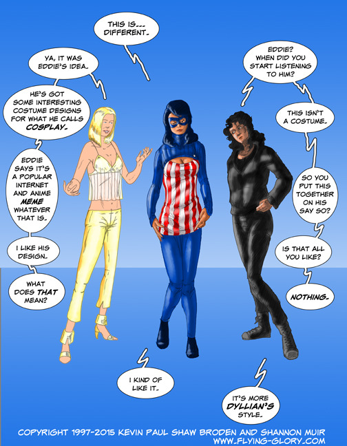
Sometime ago JList posted the anime/manga meme image of a girl in a turtleneck sweater withe a keyhole front. It turns out that there is a lot of artwork of girls in these sweaters showing off their assets. Since then a lot of artists have done their own interpretation of the sweater. So, without doing the overt sexuality of it, I wanted to do something with the sweater with my FLYING GLORY AND THE HOUNDS OF GLORY characters.
The band’s costume designer Krystal Wexler has been shown some art designs by Eddie Farmer (Capt’n Plunder of the Villains of Vengeance – stage villains during performances). Eddie is totally into Manga and Anime and designs his own Costplay outfits. So he designed a keyhole sweater based on the internet meme and Krystal liked it enough to make something for Debra (Flying Glory) to wear.
It doesn’t have the same impact as other girls wearing it would. But that’s the point. Not every super heroine can be Power Girl, and they shouldn’t be.
Anyway, enjoy. Then goes visit the FLYING GLORY AND THE HOUNDS OF GLORY webcomic at www.flying-glory.com
Well, my novel CLOCKWORK GENIE has been available online as an ebook for purchase for nearly a week now (you can click on the link to the right to purchase it at Amazon.)
So far I’ve had two sales. I’m still smiling.
This week I’ve decided to blog about the cover art of the book, which I can talk about since I drew and painted it, myself.
If you’ve been reading my blogs, or following me on twitter and facebook, you know that I am a comic book artist and draw the online comic book FLYING GLORY AND THE HOUNDS OF GLORY. I wanted to be in comics from an early age and started off as an artist, but soon realized I was a storyteller first. The art has kept up with the writing, and here’s an example.
The hardest part of art that I’ve found, even back in my illustration course in college, was the thumbnail stage. I usually draw something once and like that I have trouble trying to draw it in other designs. It was no different for this cover.
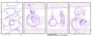
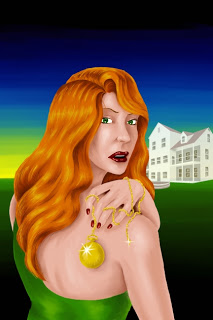
My original idea was to show an image of a golden pocket watch in the center of the art. Perhaps even superimposing a woman’s face with in it. But that didn’t quite work. The two panels of my thumbnails here represent that. Have the watch laying on a cobblestone path, or hanging from the title. Discussion this with Shannon, who has been a great help as my editor on this book, she suggested that the watch should hang from the text to one side as the woman walks off into the distance, yet looking back over her shoulder. I liked that idea; especially having the woman approximately placed helped it fit in with the Paranormal Romance of the book’s genre and market.
I liked that but thought that there might be a better way of tying the woman to the watch all the more. Read the book, the watch is very important to her.
So I brought her closer into the foreground holding the watch on her shoulder.
Either of these were still good ideas, so I decided to take them both to the next stage.
Using the 3D program POSER I set up a female figure into the poses I though best fit the images I had in mind.
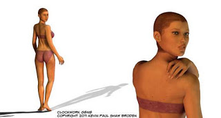
I don’t usually use Poser in my artwork, but do use it to set up poses to find the right angle and position of the body for the shot. By the time this was done, I knew I’d be using the close up image.
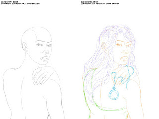
Using the Poser images as a starting point I sketched up and then penciled the pose. I would then add the hair and the pocket watch into the image on separate layers.
Using these detailed pencils, the painting began. Both the pencils and painting were done in Corel Painter.
The way I paint is not what I would suggest for others, do what works best for you. Coming out of my comic book coloring experience, I laid in flat colors first, her flesh tones on one layer, her hair on another, then the watch, and her dress.
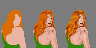
Putting the flats against a grey background, I began to paint in the shadows and shades on each of the layers. I like to use a Gouach, Broad Cover Brush for putting in the colors. Then I blend it all in using a Blender tool, different ones create different effects in the paint, and currently I’m using the Grainy Water Blender. Change the size of the point for different areas and purposes.
The same is done with light side of the figure, blending in a lighter color and finish with highlights. Sometimes the brush doesn’t create a thin enough line so I use my Variable Tip Pen, or even the pencil; again adjust the size for what’s needed.
As you’ll see I did the watch on a different layer, but dropped in the shadows on her flesh tones here.
The next part of the job, done in a separate file, was to create a background. Coming up with the right colors for the background had to be just right for the foreground figure to stand right out and not just be flat. I adjusted this several times as my original colors blended too much into her dress.
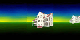
I then had to design the house for the background. This house is extremely important to the story, so it had to stand out yet not distract from the figure. I did researching and looked at a dozen or more big houses in Bel Air owned by Hollywood stars back in the 1920s and 1930s. Not wanting to copy any one of them, I found something I like and in several and blended into something new. I drew it and painted it at a large size but on a separate layer that I would be able to shrink down and adjust the shade and tone as need be.
Once pleased with the background, I dropped in my figure in front of it. Here you can see how the watch finally was incorporated.
The background would be adjusted a few more times until I was really happy.
The next assignment was to figure out what font would work best for the title on the cover. I liked several fonts, both in what came with the computer, and some that I purchased. Here is a selection of them that I was considering.
I decided to go with Baskerville SemiBold, but without the Italics.
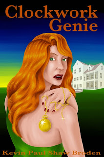
In Photoshop I started off with the title in the same color as her hair, but it didn’t stand out well enough, so changed it to a brighter yellow. Which I then used the Layer Styles to create an appropriate bevel effect on the letters.
The only problem I had now was my ‘four names of profession creativity’… my name was almost too small to visible. I had to adjust the size slightly, and then dropped a black bar underneath the text so it didn’t vanish into the flesh tones of her arm.
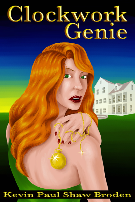
So the Clockwork Genie finally had a face and a cover. I hope you like my art, and I hope you really like the novel.
Thanks.
Kevin Paul Shaw Broden
Four Names of Professional Creativity
Hi all,
Powered by WordPress & Theme by Anders Norén